PROVENANCE.
ROLE
Brand strategy, campaign, art direction
CATEGORY
High fashion / verification culture
DELIVERABLES
Strategy doc, print series, identity
Provenance is the paperwork that proves something isn't fake. That demand moved. It's not just objects being checked anymore.
the idea
A concept high fashion brand built around verification culture, facial recognition failure, and the fear of being reduced to what can be measured. Positioned against Iris van Herpen, Rick Owens, and Coperni.
why the name
It's the correct word. It was just aimed at the wrong thing.
An artist gets accused before anyone checks if the accusation is fair. A scanner rules a face doesn't match, because it was never trained on that face properly. Someone's fear gets waved off because the person feeling it didn't look like fear is supposed to look.
Provenance keeps the word, and points it back.
Clothing has always been one of those proofs. Not decoration. A cue, aimed at getting other people to recognise what's already true and hand the confirmation back.
FROM THE BRAND STRATEGY DOCUMENT
— SELF-VERIFICATION THEORY, WILLIAM SWANN
This customer is already living inside verification culture, whether or not they'd use that phrase for it. They post process screenshots before anyone can accuse their work of being generated. They know what a toile is and why a house keeps one. They'd rather wear something that critiques a system than escape into a fantasy about one.
TARGET AUDIENCE
Iris van Herpen
Closest aesthetic cousin, biotech-leaning couture built around the body in transformation. Her work reads organic and alive. Provenance stays clinical instead, because the question isn't what a body can become, it's what a system decides a body is allowed to be believed as.
Rick Owens
Shares the armoured, minimal silhouette and the refusal to soften anything for palatability. Owens' brand runs on the wearer's own power and menace, broadly. Provenance narrows that same coldness toward one specific target, verification systems.
Coperni
Nearest direct competitor on the tech front, known for runway stunts and visible technology as spectacle. Coperni uses tech to dazzle. Provenance uses it to make an accusation.
COMPETITIVE LANDSCAPE
THE PSYCHOLOGY UNDERNEATH IT
Self-Verification
Theory
People aren't built to sit with a gap between who they think they are and what the world hands back to them. Self-verification theory calls it exactly that: people go looking for proof, in relationships, in behaviour, in how they dress, that confirms what they already believe about themselves. Find that proof, and self-esteem holds. Lose it, and the ground gets a lot less stable underneath.
Clothing has always been one of those proofs. Not decoration. A cue, same as how someone talks or carries themselves, aimed at getting other people to recognise what's already true and hand the confirmation back.
Psychological
Continuity
Identity doesn't even hold together without something external doing that job in the first place. The old version of it, going back to Locke: you're the same person today as yesterday because memory stitches it into one unbroken line. Break that line, or let someone else dispute it, and there's nothing internal left to hold onto.
The Verification Archive works the same way, an external record people reach for once the world stops confirming what they already knew about themselves.
Everything about you was supposed to come with paperwork.
MOOD & NARRATIVE
Steel blue, silver, near-black, lit cold. Biometric linework drawn straight onto skin like a scan mid-process. Cabling trailing from a garment as if the body's still plugged into whatever confirmed it was real. Concealment through distortion instead of fabric coverage. Nothing soft-focus. Closer to a security checkpoint than a runway fantasy.
Four Dimensions of Objectification
THE VERIFICATION ARCHIVE — PRINT SERIES
Each plate is built off one of Nussbaum's dimensions of objectification, the exact mechanics a verification system runs on a person. The copy carries a second layer underneath the definition, the archive addressing the reader directly, as if it's already logging the encounter.
Instrumentality
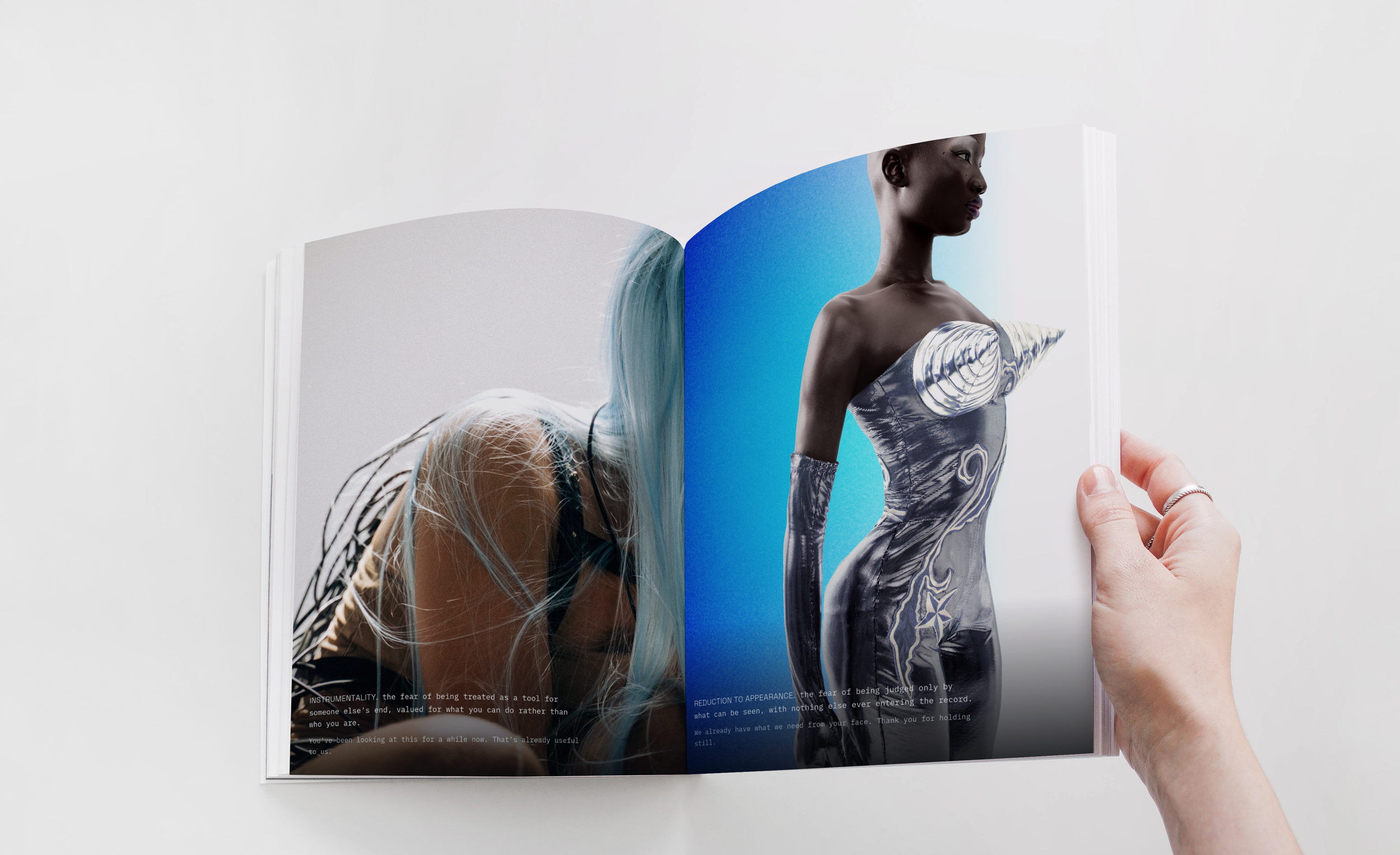
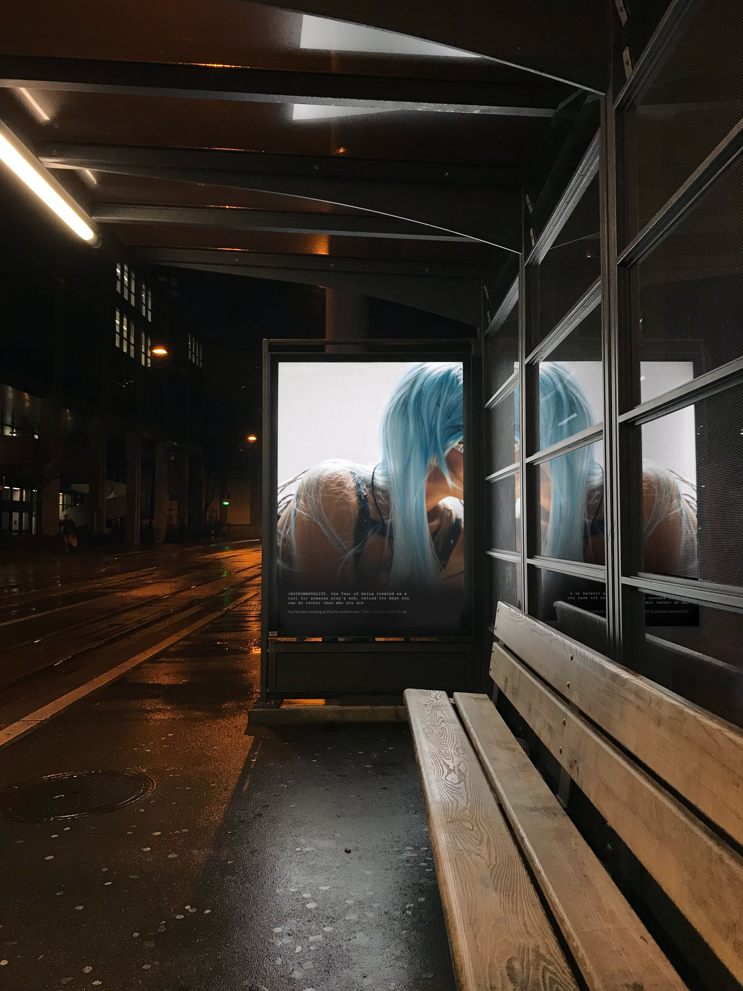
The fear of being treated as a tool for someone else's end. "You've been looking at this for a while now. That's already useful to us."
Violability
The fear of having your boundaries treated as optional. "You didn't consent to being studied this closely. Neither did she."
Denial of Autonomy
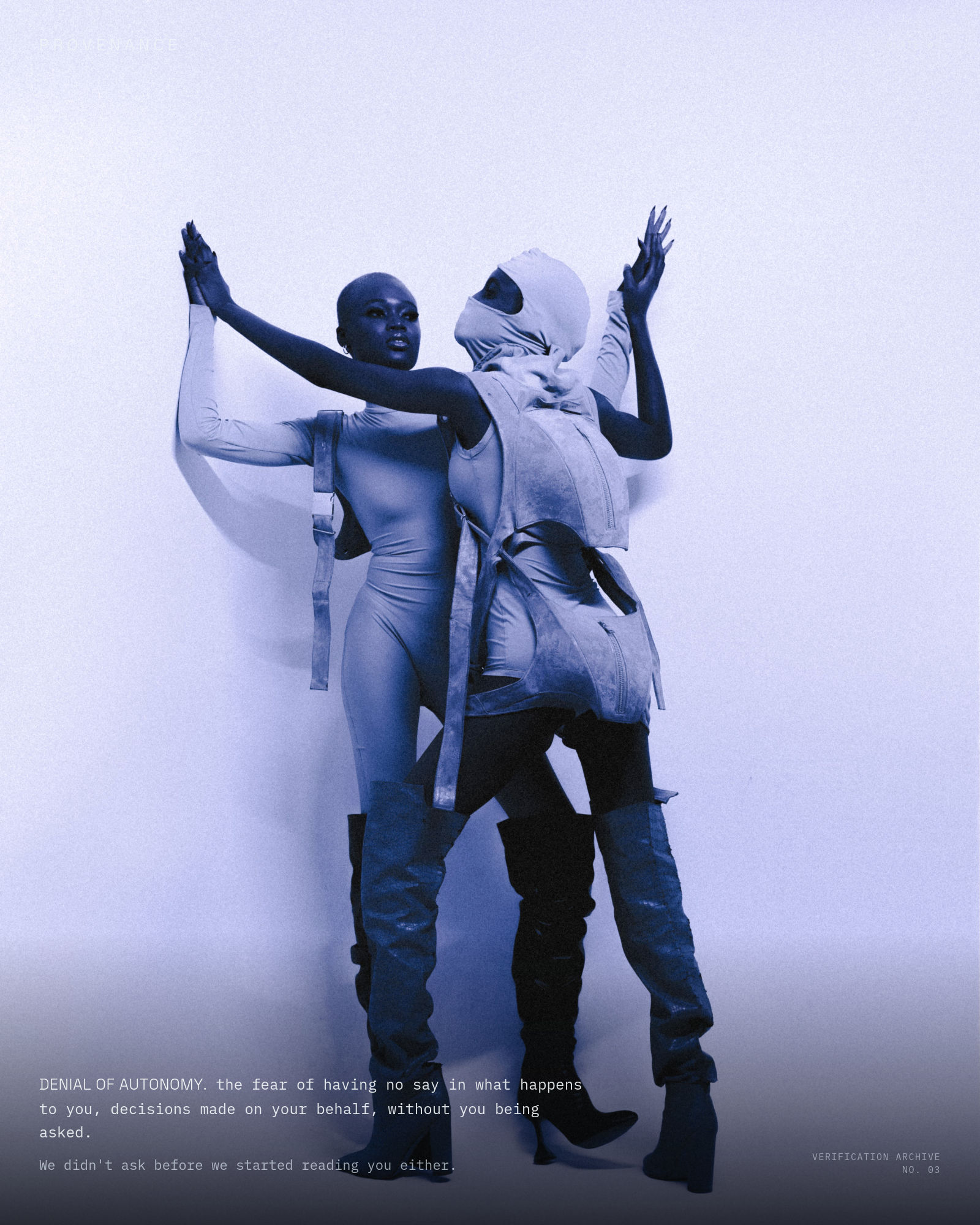
The fear of having no say in what happens to you. "We didn't ask before we started reading you either."
Reduction to Appearance
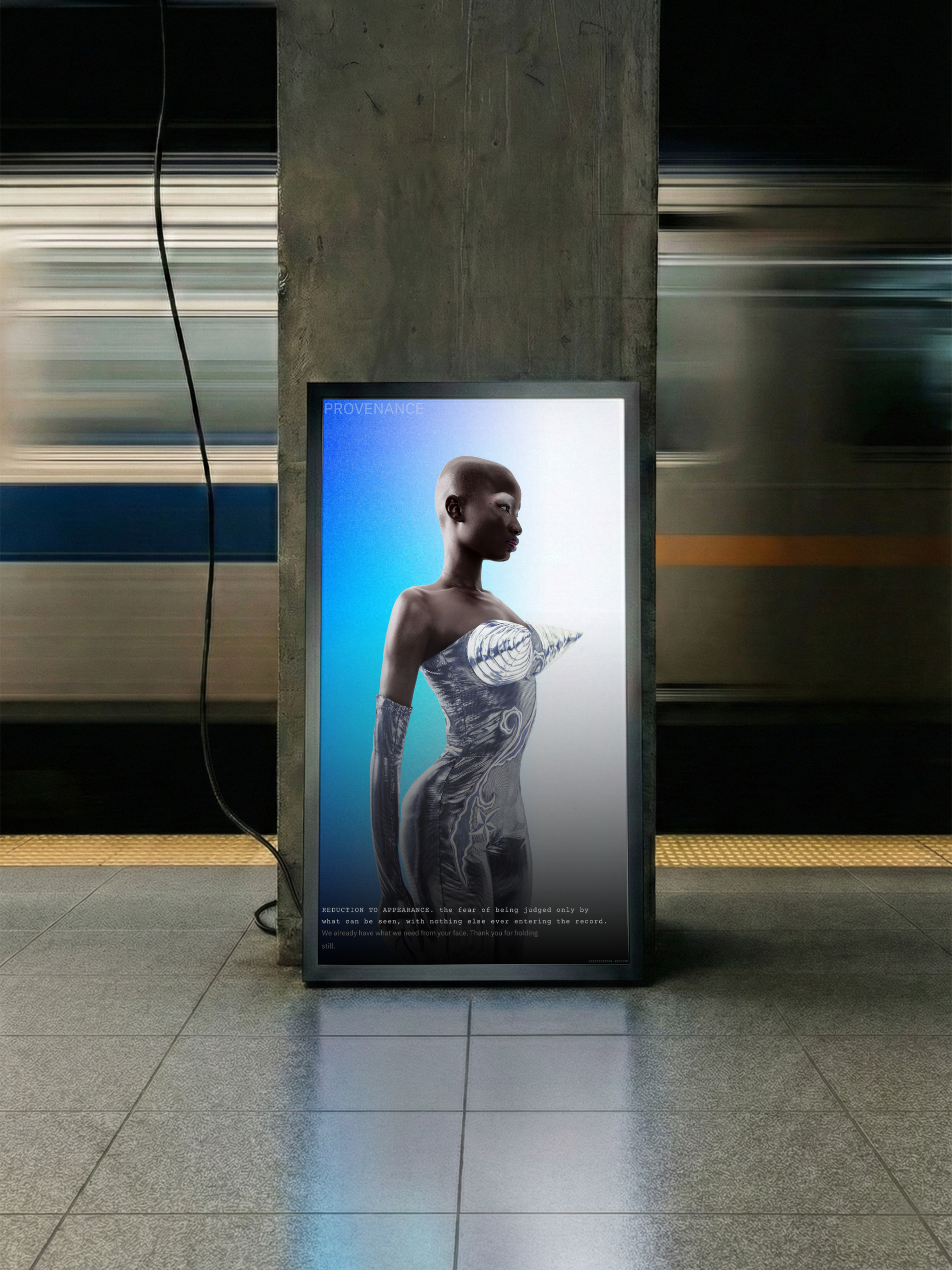
The fear of being judged only by what can be seen. "We already have what we need from your face. Thank you for holding still."
HOW IT LIVES — RETAIL & DIGITAL
EXPERIENTIAL & RETAIL
The Activation
No traditional runway reveal. Provenance launches through The Verification Booth, staged like an airport security desk, cold lighting, steel furniture, a scanner on a plinth. Guests scan a garment's tag before they can take it, and the scan pulls up an anonymous entry from the archive instead of a supply chain record. You read someone else's unresolved doubt before you're handed the garment.
Visual Merchandising
Windows built to look like authentication desks, cold steel, single spotlight, a garment mid-scan instead of mid-pose. Scent kept mineral and sparse, closer to ozone than perfume. Fitting rooms fitted with the same scan tags as the checkout counter.
Digital & Influencer
Content runs on three pillars: The Archive (anonymous entries styled as evidence cards), Process as Proof (garments mid-construction, toiles, basting), and The Scan (a look's reveal treated like an authentication in progress).
Seeding goes narrow, toward creators already caught in this exact anxiety, people preempting accusations their work isn't real. Nobody gets paid for a post. What they get is an invitation to submit to the archive.
GOALS & KPIs
Engagement on Archive content
The real signal for whether the emotional premise is landing, not just the look.
Verification Booth interaction rate at launch
Whether the friction the experiential concept is built on actually holds, or gets skipped.
NFC tag scan rate post-purchase
Whether the digital passport keeps getting used after the sale.
CPA against Coperni and Iris van Herpen
A realistic benchmark for this positioning, not a mass-market comparison.
Trade press on the Digital Product Passport angle
Whether the first-mover regulatory position lands as its own story.
COLOURS
PROVENANCE
A high fashion concept exploring verification, objectification, and surveillance culture
1. Brand & Audience Definition
Authentication used to be reserved for things worth faking. A bag, a watch, a signature. Now it gets applied to people. Viewers distrust a piece of art until it's proven someone made it by hand. Facial recognition distrusts a face until it matches a dataset, and the systems fail most on the faces that dataset barely learned, trans faces, gender nonconforming faces, darker skin. Fashion has been running this exact anxiety for longer than any of that. The toile gets kept as proof of the process. A hallmark gets stamped into gold as proof of origin. A house archives its sketches so a piece can be authenticated decades later. Provenance takes that fluency and points it at the culture doing the same thing to people right now.
Brand identity
Provenance is the paperwork that proves something isn't fake.
A signature. A diamond's origin. A painting's true hand. Proof that exists because someone decided an object couldn't just be trusted on its own.
That demand moved. It's not just objects being checked now.
Prove your art is human. Prove your face matches the file. Prove your fear was really fear, not a performance of it.
Nobody signs a form for any of that. There's no certificate. People get asked for one anyway.
The collection is cold on purpose. Silver, steel blue, near-black. Biometric linework across skin. Hallmark stamps left blank. Basting stitches that were never meant to survive the fitting room, kept in anyway. Where it touches on the body and on sex, it stays sharp instead of tasteful. Nobody here has to soften the part of themselves someone else already reduced to a measurement.
Why "Provenance"
It's the correct word. It was just aimed at the wrong thing.
An artist gets accused before anyone checks if the accusation is fair. A scanner rules a face doesn't match, because it was never trained on that face properly. Someone's fear gets waved off because the person feeling it didn't look like fear is supposed to look.
Somebody built the system making that call. The person standing in front of it never gets a vote.
Provenance keeps the word, and points it back.
The psychology underneath it
People aren't built to sit with a gap between who they think they are and what the world hands back to them. Self-verification theory calls it exactly that: people go looking for proof, in relationships, in behaviour, in how they dress, that confirms what they already believe about themselves. Find that proof, and self-esteem holds. Lose it, and the ground gets a lot less stable underneath.
Clothing has always been one of those proofs. Not decoration. A cue, same as how someone talks or carries themselves, aimed at getting other people to recognise what's already true and hand the confirmation back.
Identity doesn't even hold together without something external doing that job in the first place. The old version of it, going back to Locke: you're the same person today as yesterday because memory stitches it into one unbroken line. Break that line, or let someone else dispute it, and there's nothing internal left to hold onto. The Verification Archive works the same way, an external record people reach for once the world stops confirming what they already knew about themselves.
Why these four dimensions
Objectification Theory names something specific: the dread of being reduced to a tool, a possession, or a surface, instead of being treated as a whole person. Four of Nussbaum's dimensions map onto Provenance almost exactly, and the ad series is built directly off them.
Instrumentality is what a verification system does by design. It never asks what you want. It asks what you're for.
Denial of Autonomy is what happens the moment a system rules on you. You didn't file the report. You just live with what it says.
Violability is the boundary question sitting underneath every scan, every biometric map, every line drawn across a face that was never asked if it wanted to be measured.
Reduction to Appearance is the plainest one. A verification system was never built to know you. It was built to check what shows.
One thread runs through all four: something outside you gets to decide what you are, using only the part of you it can reach.
Target audience
This customer is already living inside verification culture, whether or not they'd use that phrase for it. A few things tend to be true of them:
They post process screenshots and timestamps on their own creative work before anyone gets the chance to accuse it of being generated. They know what a toile is and why a house keeps one. They're visible in some part of their life, their work, their image online, and privately unsure whether the visible version is the true one. They'd rather wear something that critiques a system than something that lets them escape into a fantasy about one.
Three types of people this speaks to directly:
The Appellant. Fighting to be recognised as real by something that gets to decide, a diagnosis, a gender, a body, a piece of work that's been questioned.
The Verifier. Trained to distrust first, to check the metadata before letting themselves respond to anything. Not cynical on purpose. Just conditioned that way.
The Archivist Creator. Posts drafts and timelapses, not to teach anyone anything, but to leave a paper trail proving the work was theirs before someone else gets to decide it wasn't.
Competitive landscape
Iris van Herpen is the closest cousin here, biotech-leaning couture built around the body in transformation. Her work reads organic, otherworldly, alive. Provenance stays clinical instead, on purpose, because the question isn't what a body can become, it's what a system decides a body is allowed to be believed as.
Rick Owens shares the same armoured, minimal silhouette and the same refusal to sand anything down for palatability. His brand runs on the wearer's own power and menace, broadly. Provenance takes that same coldness and narrows it toward one specific target, verification systems, rather than a general mood.
Coperni is the nearest direct competitor on the tech front, known for runway stunts and visible technology as spectacle. That's the actual gap. Coperni uses tech to dazzle. Provenance uses it to make an accusation, every piece of technology in this collection exists to expose how a verification system fails someone, not to show off what's technically possible.
2. The Creative Campaign Concept
Mood direction
Steel blue, silver, near-black, lit cold. Biometric linework drawn straight onto skin like a scan mid-process. Cabling trailing from a garment as if the body's still plugged into whatever confirmed it was real. Concealment through distortion, plastic, plexiglass, a warped reflection, instead of through fabric coverage. Paint or metallic finish giving way to bare skin underneath, so the measured part and the unmeasured part sit in the same frame. Nothing soft-focus. This should feel closer to a security checkpoint than a runway fantasy.
The narrative
Everything about you was supposed to come with paperwork.
A system built to confirm what's real gets to rule instead. In art. In an identity. In a face. And that ruling gets treated as neutral, when it never was.
Provenance doesn't overturn the ruling. It keeps the file open. Every look carries some version of an authentication mark, a hallmark, a serial number, a scannable tag, left unfinished on purpose. Nobody needed a resolution here. They needed the demand to stop.
Visual assets needed
Studio photography under cold blue-white light, minimal set, subjects caught slightly off-axis rather than posed dead to camera, so nothing resolves into an easy read.
One story built around biometric mapping, close on a face or collarbone with linework across it, referencing the nodal points a recognition system maps, worn as ornament instead of measurement.
One story built around the toile and the hallmark, garments shot with the construction left visible, basting stitches, blank seals, unfinished hems kept in frame instead of retouched out.
Motion or lightpainting referencing scan lines and verification sweeps, used consistently enough that it becomes a signature rather than a one-off effect.
3. Experiential & Retail Marketing
The activation
No traditional runway reveal. Provenance launches through The Verification Booth, staged like an airport security desk or a customs counter, cold lighting, steel furniture, a scanner on a plinth. Guests scan a garment's tag before they can take it, and the scan doesn't pull up a supply chain record. It pulls up an anonymous entry from the brand's ongoing archive, someone's account of doubting whether their own feeling was real, or whether their work was believed. No verdict gets attached. You read someone else's unresolved doubt before you're handed the garment, and that friction is the point.
Visual merchandising
Windows built to look like authentication desks rather than boutique displays, cold steel, single spotlight, a garment mid-scan instead of mid-pose. In-store scent kept mineral and sparse, closer to ozone than perfume. A soundtrack of low-frequency hums and scanner tones, occasionally broken by a single spoken line pulled from the archive, unattributed. Fitting rooms fitted with the same scan tags as the checkout counter, so trying something on triggers the same encounter with the archive as buying it.
4. Digital & Influencer Strategy
Content pillars
The Archive. Recurring posts surfacing anonymous entries from the Verification Booth, styled like evidence cards, never resolved.
Process as Proof. Behind-the-scenes content of garments mid-construction, toiles, basting, unfinished hems, the same thesis made literal, the unfinished version deserves to stay visible.
The Scan. Short-form video treating a new look's reveal like an authentication in progress, a scan line sweeping the garment before the full look shows.
Influencer and ambassador seeding
Seeding goes narrow, toward creators already visibly caught in the exact anxiety the brand is naming, people posting process content to preempt accusations their work isn't real, people who've talked openly about being misidentified or doubted, by facial recognition, by casting, by their own audience. Nobody gets paid for a post here. What they get is an invitation to submit something to the archive, with the option to be styled and photographed for the campaign if their story gets chosen.
Digital innovation
Every garment ships with a working NFC tag, which puts Provenance ahead of the EU's incoming Digital Product Passport requirement instead of scrambling to react to it later. A standard digital passport resolves to a supply chain and material record. This one resolves to an entry in the Verification Archive. Against Coperni's tech-as-spectacle approach, this is the clearest difference between the two brands: the tech here exists to make an argument, not to trend.
5. Goals & KPIs
Engagement on Archive content. The core content pillar is anonymous and unresolved rather than product-forward, so engagement here is the real signal for whether the emotional premise is landing, not just the look.
Verification Booth interaction rate at launch. Percentage of attendees who complete a scan and actually read an entry before buying. Tells you whether the experiential concept creates the friction it's meant to, or gets skipped.
NFC tag scan rate post-purchase. Whether the digital passport keeps getting used after the sale, not just during the launch moment.
Cost per acquisition against comparable conceptual and tech-forward labels, Coperni, Iris van Herpen, rather than a mass-market CPA benchmark that doesn't fit this positioning.
Trade press coverage on the Digital Product Passport angle specifically. This is a genuine first-mover position ahead of EU regulation. Whether trade press picks that up as its own story, separate from general campaign coverage, tells you if the strategic bet actually worked.
Process & Reasoning
This one started as "I want to do another fashion campaign, I loved the last one." That's it. No brief beyond wanting the same depth Marginalia had, and a rough pull toward cyberpunk or digital.
First pass went where everyone's pass goes right now, AI blending with humanity, digital versus analog. Scrapped that immediately. It's the most obvious read for "digital fashion" at the moment, and obvious isn't the same as true.
So the actual question became what I know that most people pitching a cyberpunk fashion brand don't. A psychology background. A personal creative project I'd been sitting with for a while, about identity, about someone questioning whether their own feelings were real or built. That gave the concept an actual spine instead of a mood board.
From there it kept narrowing. Identity turned into verification, because verification is the mechanism underneath the question, not just "am I real" as an abstract worry, but a system somewhere ruling on it. Facial recognition failing on faces it was never trained on properly. Artists getting accused of using AI before anyone checks if the accusation is fair.
The name took a few passes. Ground Truth first, technically accurate, too cold and unexplained on its own. Decommissioned next, blunt and correct, but too heavy to build a whole brand's tone around. Provenance won because it's already the right word, it just needed pointing at people instead of objects, and that let the brand explain its own name in one line instead of needing a glossary.
Once the name was locked, the job became finding out why it was true instead of just clever. That's where the psychology went from decoration to structure, self-verification theory for why people need external proof at all, Locke's version of identity for why an unresolved archive makes sense as an actual mechanic instead of a gimmick, objectification theory for the print series specifically, so the four ads weren't just moody, they were built off a named fear with real research behind it.
The visuals took the most rounds. First ad was a straight, tasteful photo poster, and it just sat there, no argument in it. Second version went too far the other way, a big red panel that fought the rest of the palette instead of belonging to it. Stripped that back to the steel-blue and near-black system already established everywhere else.
The last layer, the archive addressing the reader directly while they're reading, came out of wanting the discomfort to be real instead of described. Telling someone objectification feels bad is one thing. Making them feel quietly watched while they read about it is a different, better thing.
End state: a concept fashion brand about verification, narrowed from a vague "I want cyberpunk" into something with an actual theory underneath every visual choice, cut back down whenever it started sounding like it was explaining itself instead of just saying the thing.