
Iyashi Psychology
Brief: A psychology practice supporting the mental health of young people and older adults. The visual direction draws on kintsugi, the Japanese art of repairing broken pottery with gold, translated into a mark built around blue and yellow.

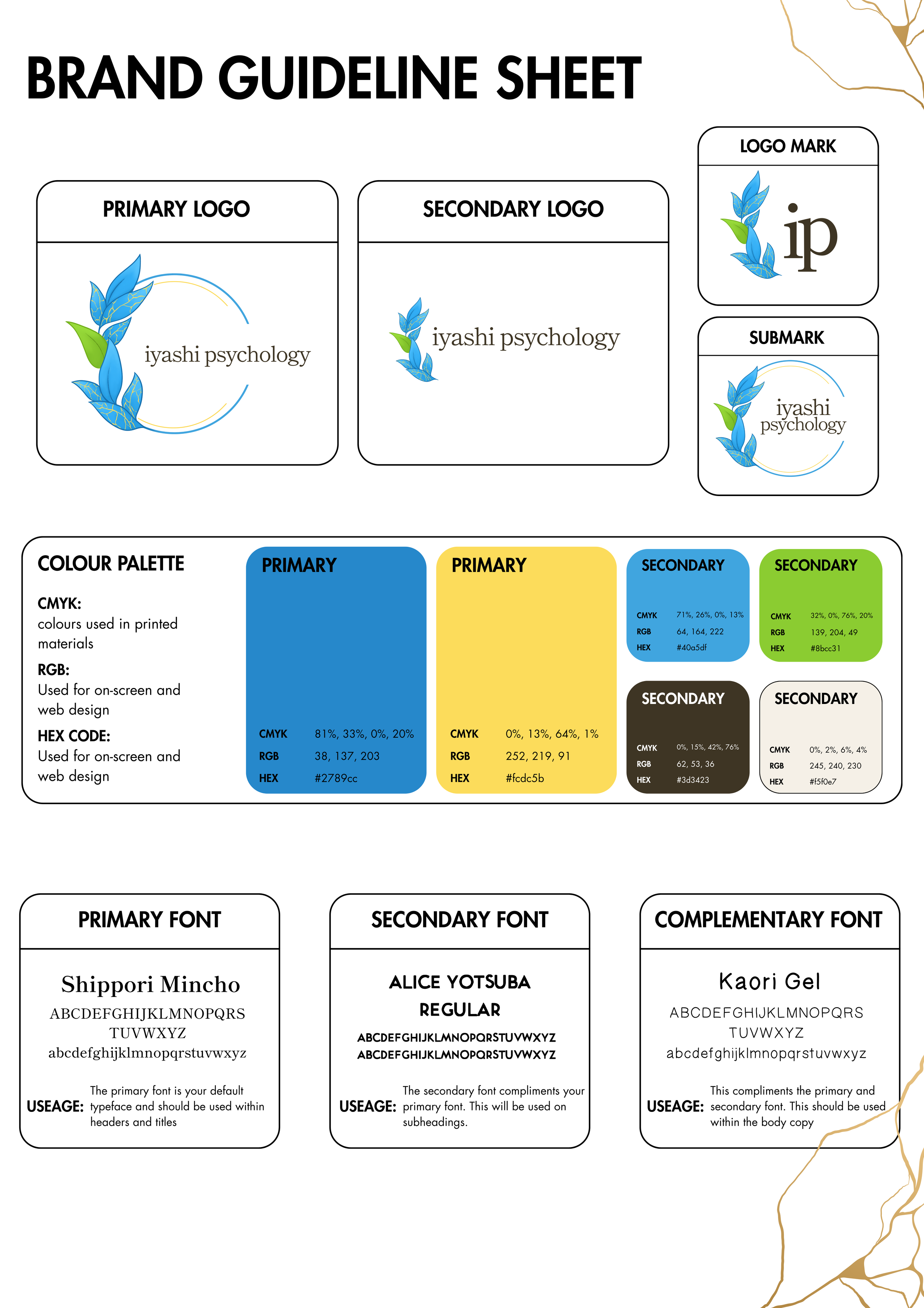

Iyashi means healing, and the mark leans directly into that. Gold veins run through a blue leaf motif the same way gold lacquer runs through a mended crack in kintsugi pottery, the idea that something repaired is worth showing rather than hiding. Built to work across a genuinely wide age range, young people and older adults, without skewing too young or reading as clinical.
Deliverables: Primary logo, secondary logo, submark, and logomark. Full colour palette, two primary tones (blue and yellow) plus four secondary tones. A four-tier type system, primary, secondary, complementary, and a dedicated accessible typeface (Verdana) for readers with dyslexia or reading difficulty. Full brand guideline sheet.