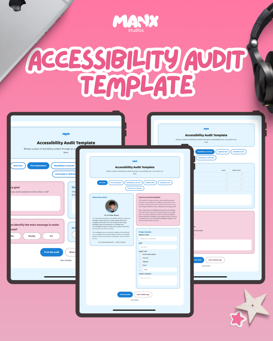
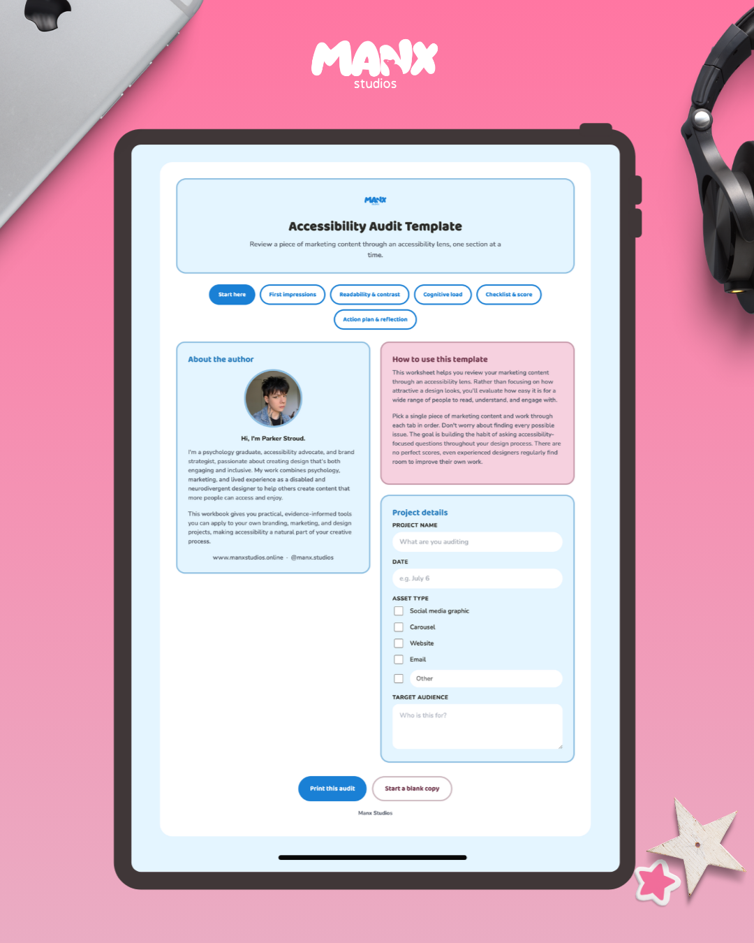
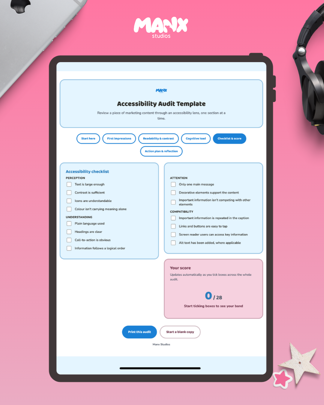
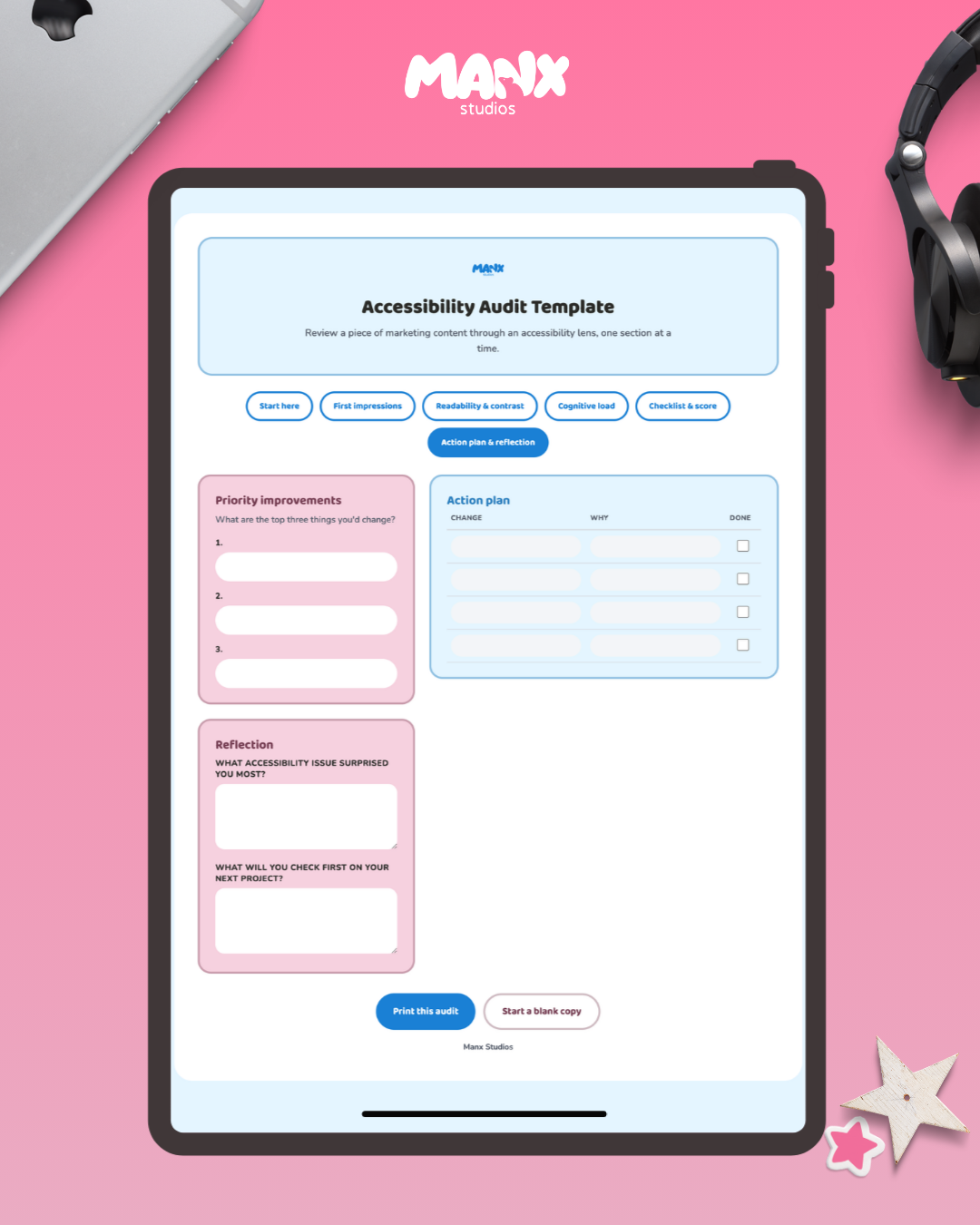
A worksheet for reviewing your marketing content the way it actually gets used, not just how it looks in the design file. Built from lived experience as a disabled and neurodivergent designer, alongside a psychology background in how people actually process information.
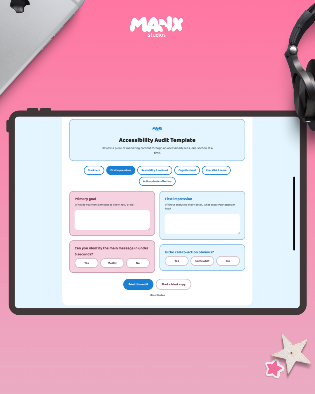
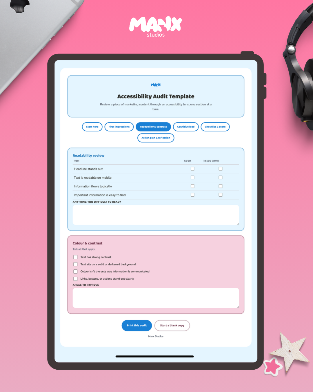
Walk through first impressions, readability, colour and contrast, cognitive load, and a full accessibility checklist covering perception, understanding, attention, and compatibility. Every box you tick feeds into a live score at the end, so you can see where a piece of content stands without doing the maths yourself.
Finishes with an action plan and a reflection page, so the audit turns into actual changes instead of just a list of problems.
No results match your search. Try removing a few filters.
